
Written by Mara Lindqvist, visual designer and color strategist with over 9 years of experience in brand identity and digital UI design.
You pick a shade that feels fresh, electric, alive. It looks stunning on your screen. Then it lands in your design, and suddenly it’s clashing with everything — or worse, it’s disappearing into the background like it was never there.
That’s what happens when you use cyanová without understanding it. Not because you lack taste, but because this color has rules. Very specific ones. And once you know them, you’ll wonder how you ever designed without it.
This article breaks down exactly what cyanová is, how to use it properly, where designers go wrong, and how to make it the strongest color in your palette.
What Is Cyanová — And Why It’s Not Just “Cyan”
Most people assume cyanová is just a fancier word for cyan. It’s not.
Cyanová is a saturated blue-green hue that sits closer to electric blue than to teal, with a distinctly cool, high-energy visual presence. The word comes from Czech and Slovak, where it literally translates to “cyan-colored” — but in design practice, it refers to a specific range of vivid, cool-toned hues that carry more visual weight than standard cyan.
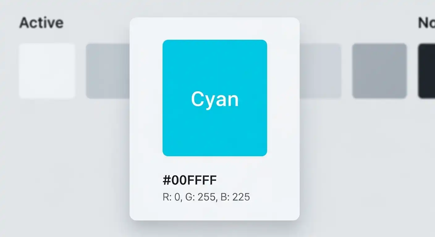
Standard cyan lives at roughly #00FFFF — it’s almost blinding at full saturation. Cyanová, when used intentionally in design contexts, typically refers to rich, refined variants like #00B4D8, #0096C7, or #48CAE4 — tones that carry the same energy but are actually usable on a real screen.
The difference matters because:
- Standard cyan burns the eye and fails accessibility contrast checks
- Cyanová shades maintain vibrancy while staying legible
- The hue leans blue in shadow and green in highlight, making it visually dynamic
It behaves differently from other blues. It advances toward the viewer instead of receding. That’s a design superpower when you know how to use it.
Cyanová in the Real World: A Designer’s Scenario
Imagine you’re building a SaaS dashboard for a fintech startup. The brief says: modern, trustworthy, but not boring.
Navy blue feels safe but stale. Bright green reads as “health app.” But cyanová? It splits the difference. It carries the rationality of blue and the energy of green without committing to either.
Here’s how that plays out in practice:
The designer sets the primary action color — buttons, links, progress bars — to #0096C7. The background stays a deep charcoal #0D1B2A. Text is near-white at #E8F4F8.
The result: the dashboard feels technical without feeling cold. It signals precision without the corporate stiffness of navy. Users in testing described it as “crisp” and “focused.”
That’s cyanová doing what it does best — anchoring a palette without dominating it.
Magellan’s Pass: The Route That Changed the World
How to Use Cyanová Step by Step
Whether you’re applying it to a website, app, or brand identity, follow this sequence:
- Lock your base shade first. Choose one cyanová hex as your anchor. Don’t mix multiple cyan-adjacent tones in the same project — it dilutes the effect.
- Set your contrast pairing. Cyanová works best against deep darks (charcoal, navy, near-black) or pure white. Avoid light grays — they flatten it.
- Use it for one purpose only. Pick either UI interaction (buttons, links, highlights) or decorative use (backgrounds, accents). Not both. When cyanová appears everywhere, it stops being a signal.
- Test at 50% opacity. A cyanová overlay at reduced opacity on a dark background creates a gorgeous ambient glow effect. Tools like Figma and Adobe XD make this easy to preview.
- Check contrast ratios. Run your cyanová text or icon color against your background through a contrast checker. WCAG AA requires a 4.5:1 ratio for normal text. Many cyanová shades pass on dark backgrounds but fail on white.
- Build a tint scale. Generate 10%, 20%, and 40% tints of your cyanová for hover states, disabled states, and background washes. This keeps the palette cohesive without overusing the full shade.
Common Mistakes People Make With Cyanová
Most problems with cyanová come from a few repeatable errors.
Mistake 1: Pairing it with warm colors without a buffer. Cyanová and orange feel exciting in theory. In practice, they vibrate against each other and cause visual fatigue. If you must pair them, add a neutral — charcoal, stone, or off-white — between them.
Mistake 2: Using it on a white background at full saturation. Full-saturation cyanová on white is almost physically uncomfortable to read. Drop the saturation slightly (shift toward #2EB8D1 rather than #00FFFF) or switch to a very light cyanová tint for backgrounds.
Mistake 3: Treating it like a neutral. It is not a neutral. It is an accent. The moment you use it for body text, form borders, and button fills simultaneously, the design falls apart.
Mistake 4: Confusing it with teal for brand identity. Teal leans green and reads as wellness, nature, or calm. Cyanová leans blue and reads as technology, precision, speed. They are not interchangeable. Using teal when you mean cyanová sends the wrong brand signal.
Cyanová vs. Related Colors: Quick Comparison
| Property | Cyanová | Standard Cyan | Teal | Electric Blue |
|---|---|---|---|---|
| Hue direction | Blue-green | Pure blue-green | Green-blue | Pure blue |
| Emotional tone | Precise, energetic | Harsh, clinical | Calm, natural | Cold, technical |
| Best use | UI accents, tech brands | Print only | Wellness, nature brands | Data visualization |
| Readability on white | Medium | Poor | Good | Good |
| Readability on dark | Excellent | Good | Medium | Excellent |
| Saturation handling | Flexible | Needs reduction | Flexible | Needs reduction |
The key takeaway: cyanová is the most versatile of the group because it adapts across dark and light environments without fully losing its character.
Pro Tips for Using Cyanová Like a Senior Designer
- Gradient it with deep blue, not green. A gradient from
#0096C7to#023E8Afeels premium and directional. A gradient toward green starts looking like a health product. - Use it for data visualization. In charts and graphs, cyanová stands out from reds, yellows, and purples without screaming. It’s particularly effective as the “positive” or “active” data series color.
- Let it breathe. Surround cyanová elements with generous white space or dark padding. Color works hardest when it has room to exist.
- Match your typography weight. Thin, light fonts in cyanová disappear. Use it with medium or bold weight type for full impact.
- Test on real devices. Screens render cyanová differently. An OLED phone shows it with extreme vibrancy. A budget LCD washes it out. Always preview across device types before finalizing.
Frequently Asked Questions About Cyanová
What hex code is closest to cyanová?
The most commonly referenced cyanová shades are #00B4D8 and #0096C7. Both carry the vivid blue-green quality of the color while remaining usable in real design contexts.
Is cyanová the same as turquoise?
No. Turquoise leans greener and lighter, often with a softer, more muted tone. Cyanová is cooler, more saturated, and leans distinctly toward blue.
Can cyanová work for a professional or corporate brand?
Yes — when paired with dark navy or charcoal, cyanová reads as sharp and modern rather than playful. Many tech companies use it precisely for this reason.
Does cyanová work in print design?
It does, but it prints differently than it displays. In CMYK, ask your printer for a proof — cyanová often shifts slightly green in offset printing. Adjust your CMYK values to compensate.
What fonts pair well with cyanová?
Geometric sans-serifs like Futura, Montserrat, or DM Sans work well because they share cyanová’s clean, technical energy. Avoid decorative scripts — the contrast is too jarring.
How do I use cyanová without making my design look like a tech startup cliché?
The answer is restraint and unexpected pairings. Try cyanová with warm stone tones (#C9B99A) or dusty rose instead of defaulting to white and dark navy. The unusual pairing makes it feel intentional, not templated.
Your Next Step With Cyanová
Cyanová earns its place in any serious designer’s toolkit — but only when you treat it with the specificity it demands. It’s not a default blue, not a casual accent, and definitely not a neutral.
Pick one cyanová shade, assign it one role in your design system, and test it on dark. That single decision will tell you immediately whether it belongs in your project — or whether a different hue will do the work better.
Start there. The rest follows.
